 "ttyymmnn" (ttyymmnn)
12/26/2015 at 13:05 • Filed to: None
 2
2
 9
9|
"ttyymmnn" (ttyymmnn)
12/26/2015 at 13:05 • Filed to: None | 2
| 9 |
I understand that it’s easier for web designers to make one site design that works for both mobile and desktop (the New York Times is one significant holdout). But these new hybrid sites look so terrible on the desktop that I’m going to see if I can “go mobile” on my desktop. I suppose that, for most things you do on the web, you’re just reading anyway, though it won’t really work well for writing long posts. Now, what to do with all this extra real estate? Maybe I can start enjoying my rotating desktop wallpaper.
 MGS315
> ttyymmnn
MGS315
> ttyymmnn
12/26/2015 at 13:47 |
|
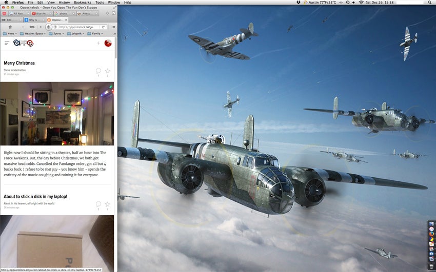
RAF B-25s? I like.
|
ttyymmnn
> MGS315
12/26/2015 at 14:03 |
|
Here’s the entire image.

|
MGS315
> ttyymmnn
12/26/2015 at 14:29 |
|
Awesome! I am so stealing that.
|
ttyymmnn
> MGS315
12/26/2015 at 14:30 |
|
Well, I stole it from somewhere else, so be my guest!
 AfromanGTO
> ttyymmnn
AfromanGTO
> ttyymmnn
12/26/2015 at 16:24 |
|
Awesome! Just did! ;-)
 Nick Has an Exocet
> ttyymmnn
Nick Has an Exocet
> ttyymmnn
12/26/2015 at 18:41 |
|
They don’t have to look terrible, but it gets quite complex real quick. For example, my company’s website does a fairly good job. There are a ton of UX considerations though when designing a site for both touch and mouse. It starts to get expensive when you say to a developer: yeah, make that widget differently for touch.
|
ttyymmnn
> Nick Has an Exocet
12/26/2015 at 20:24 |
|
Some definitely do it better than others. This
France 24
site is rather annoying, with all its boxed content, but the
Washington Post
does soemething similar, but without the obvious boxes. I think Gawker actually does a pretty good job with theirs.
 The Powershift in Steve's '12 Ford Focus killed it's TCM (under warranty!)
> ttyymmnn
The Powershift in Steve's '12 Ford Focus killed it's TCM (under warranty!)
> ttyymmnn
12/28/2015 at 09:28 |
|
Have you tried ‘zooming out’ to 90% or so? With Kinja’s latest update, the full screen mobile look took over and drove me nuts. Going to 90% zoom gives me a bit more of a ‘desktop’ view.
|
ttyymmnn
> The Powershift in Steve's '12 Ford Focus killed it's TCM (under warranty!)
12/28/2015 at 18:06 |
|
I view all Gawker sites at 90% on FF. Doesn’t change much except the laughably huge font. I’ve now given up on giving up, and am back to the full desktop site. It was too much of a hassle, since I had to keep opening new, full-sized windows for other sites.